Dashboard Widgets

Built-In Visual Control

I designed a more visually intuitive dashboard experience that transformed analysts’ workflows by reducing support tickets, increasing task clarity, customer engagement, and satisfaction.

Client

AT&T Cybersecurity (acquired by LevelBlue)

Role

Product UI Designer

Team

Worked with our UX Lead

Timeframe

8 Weeks

Skills

 UI Design, Design Research, Wireframes, Design Systems, Accessibility, Prototyping

Due to NDA contractual agreements, detailed work is available on request.

Dashboard widget illustration
A section from Add Dash Widget select format

A section from Add Dash Widget select format

Section of Edit Widget Data Type in menu

Section of Edit Widget Data Type in menu

Section of Edit Widget with View by and chart type selected

Section of Edit Widget with View by and chart type selected

Section of added chart to a widget

Section of added chart to a widget

Context & Problem

Black-and-white illustration showing a dashboard customization problem and proposed solutions. On the left, a “Create New Dashboard” modal appears on a monitor with limited visual context, signaling user confusion. Dashed lines connect to two solution concepts on the right: clear visual cues for layout guidance and dynamic widget previews with drag-and-drop interactions, illustrating how visual feedback improves customization confidence.

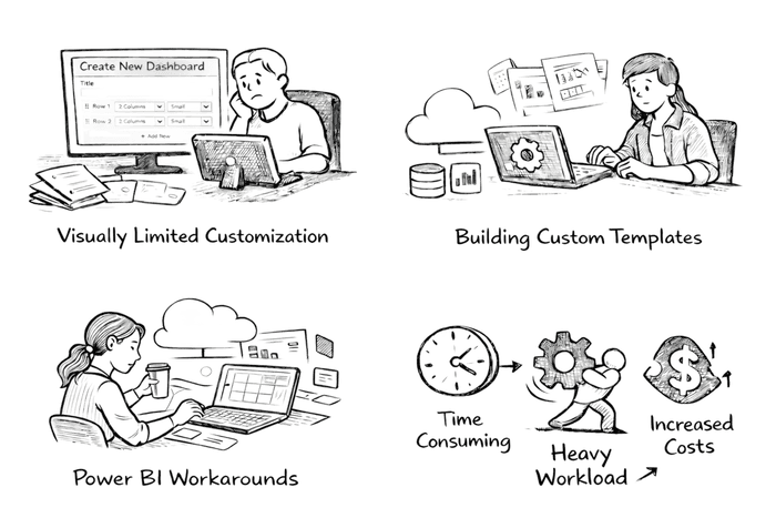
Dashboard customization was a major pain point in the product. The experience was visually limited, unintuitive, and difficult to adapt to real analyst workflows, which directly impacted adoption and efficiency. Instead of using the built-in tools, analyst developers were creating dashboard templates from scratch, while security analysts hacked together Power BI plugins just to gain the flexibility and visibility they needed. What was meant to empower users had turned into a workaround-heavy process, increasing friction, support load, and operational overhead across teams.

Preliminary Research & Findings

Through analysis of support tickets, internal feedback, and analyst interviews, we identified why dashboard customization was failing. Users couldn’t clearly see what they were adding or editing, and the lack of visual cues made changes feel uncertain. Once a layout was selected, there was no clear visual reference for how widgets were placed or updated, especially as dashboards grew larger.

As dashboards became more complex, layouts didn’t scale well, which slowed users down and led to drop-off in usage. Many users abandoned the tool altogether and relied on manual templates or external tools to regain control. We explored systems that handle customization well, drawing inspiration from iOS-style widget interactions to inform a more visual, confidence-driven desktop experience.

A black-and-white illustrated diagram showing a dashboard customization problem and its design solutions. On the left, a desktop monitor displays a “Create New Dashboard” modal with limited visual context, paired with a question mark to indicate user uncertainty. Dashed lines connect this problem to two solution concepts on the right: clear visual cues for layout guidance and dynamic widget previews with drag-and-drop interactions, illustrating how visual feedback improves confidence and usability in dashboard customization.
A section from Add Dash Widget select format

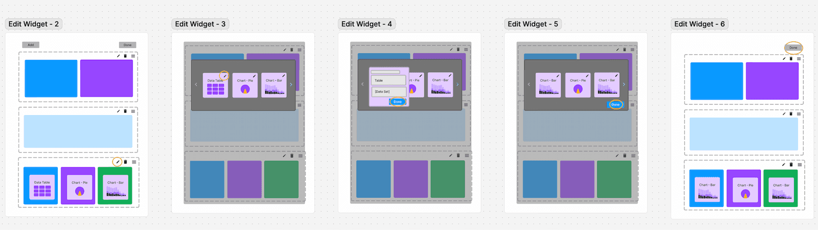
Section of wireframes exploring edit dashboard widget options.

Outcomes & Impact

A section from Edit Content and Save Widget to Dash

A section from Edit Content and Save Widget to Dash

The redesigned, visually intuitive customization experience reduced support tickets by removing ambiguity around adding and editing dashboard widgets. Expanding the layout to better use desktop space allowed users to group related widgets within a single, meaningful viewport. Clear visual cues helped users understand available options, placement, and relationships between widgets as they built their dashboards. 

With these cues built directly into the interface, users engaged more confidently with customization, better understood their tasks, and no longer needed to rely on manual templates or external tools. The result was higher adoption, reduced support load, smoother analyst workflows, and improved customer satisfaction.

Reflection & Growth

Looking back, this project reinforced how closely design clarity and business outcomes are linked. The customization tools were powerful, but without clear visual cues, users lacked confidence and avoided the feature altogether, driving support load and workarounds. I learned that validating interaction patterns early, even through quick testing, can help prevent costly rework and adoption issues later. With more time, I’d explore smarter defaults, saved layouts, and track long-term usage trends to ensure the experience continued to scale as customer needs grew.

Due to NDA contractual agreements, detailed work is available on request.